Extruded Graphs ... cont


Some types of three-dimensional landscape models have shown themselves capable of presenting useful information to the general public. The model above offers rotation only on the y-axis, this allows the hidden data in back to be seen.

Free and open, three-dimensional rotation of extruded data (in any and all directions) of either extruded model examples offer no benefits to the viewer. It only serves to confuse and frustrate them with unusable visual data.

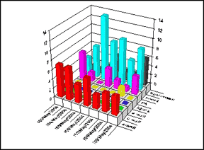
It is interesting to note that these charts borrow two-dimensional conventions of connecting the zero points of the data in the far corner. The rotation of the data, it's pivot point is in the center of the model. When rotated the data follows paths dictated by the center point and not the zeroed corner Unlinked, the ability to use the rotation of the model for data visualization fails.

If we seek as a goal a hyper-euclidian form, one that gives value to the data in conjunction with the viewing angle, designers might find a better starting position in arranging the data along the lines of user action and not prior visual schemas.

 
Process


The use of abstract three dimensional models to depict processes and relationships of complex structures appears to the limited to the icon replacement strategy of Colin Ware. While user testing supports individual aspects of this form - as a whole it been less than successful. Its primary failing is the misunderstanding between recognizablity and usability. Three dimensional forms bring dramatic visual data into a scene. This data however does not readily support the abstract data shown. In a sense, it takes on a life of its own. The shapes and shading makes labeling exceedingly difficult. If value is to be found in this genre, a new, very broad, complex, visual language must be learned. Rotating the model above also offers no benefits to the user.


Spatial Narrative
Rotating an object changes the visual relationships in a predeterminable mathematic fashion. Might it be possible to arrange visual data objects in a way that takes advantage of this. Is there a visualization method that works with the affordances of digitally generated three-dimensional space rather than be destroyed by it?

Given the comparative nature of data in charts and graphs, It is unclear if this is possible, clearly a breakthrough would be needed. To be honest, these are just musings and my efforts so far scattered and ungrounded in user research. For the above issue, I can only offer the Dali menu which touches on the occlusion of data (it disappears behind the viewer) By default, this allows more focus on the data in front of the user.

I am however finding interesting moments of success in exploring Diagrammatic Space. Typically not centered on visual comparisons of volume, diagrams highlight connectivity and actions between forms. This new role of action opens the door to three-dimensional interactive presentation. Also these diagrams consist of complex - multi-leveled ideas and constructs. A spatially based diagram would allow exploration inside and outside of the model. This is similar to the rising use of three dimensional maps to situate knowledge. Often, on the TV news, a map of a country is shown upon which we zoom in and see details of city streets, marked by informative text and icons.


[ next page ]